Why would anyone with a long enough time horizon invest in anything other than equities, given they have the highest expected return? The discussion has reignited following an article titled Beyond the Status Quo: A Critical Assessment of Lifecycle Investment Advice by Anarkulova, Cederburg & O’Doherty [1], in which they argue that long-term retirement savers would be best served by an all-equity portfolio.
100% equities goes against the very first tenets of finance theory, which says you first select your portfolio with the aim of maximizing Sharpe ratio and then lever (or de-lever) that portfolio to your preferred risk level. In practice, maximizing Sharpe ratio implies broad diversification both within and across asset classes. This has been brought up most vocally by Cliff Asness [2] in his recent article Why Not 100% Equities (Or “I Can’t Believe We Are Doing This One Again”) and originally already in his 1996 [3] piece Why Not 100% Equities – A diversified portfolio provides more expected return per unit of risk., where he shows empirically that diversified and monthly rebalanced 60% equities / 40% bonds, so called 60/40 portfolio, has historically outperformed 100% equity portfolio when levered to the same volatility. Jeremy Schwartz [4] replicates Asness’s results in his article An Update to Cliff Asness’s Study on the Benefits of a Levered 60/40 and confirms that the outperformance has continued out-of-sample.
In this article, we will delve into the theoretical underpinnings explaining why a leveraged 60/40 portfolio, adjusted to match equity volatility, has historically yielded higher realized mean return compared to a portfolio comprised entirely of equities. We’ll explore how to precisely quantify the expected outperformance. Additionally, we’ll discuss the theoretical basis behind the expected lower drawdown risk of a leveraged 60/40 portfolio, assuming all else remains constant. Our analysis reveals that by equalizing volatility across portfolios, differences in mean growth rates and drawdown risks can be attributed solely to differences between Sharpe ratios. Furthermore, we demonstrate that if an investor is open to leveraging beyond the volatility of a 100% equity portfolio, the rationale for an all-equity strategy becomes even more dubious, as the higher Sharpe portfolio is expected to outperform to a greater extent with higher target volatilities. Empirical evidence supports our theoretical frameworks, as demonstrated both in our own tests and in a test using data and reverse-engineered Sharpe ratios from Asness’s original empirical test from 1996.
The math
The mathematical framework we present is precise when utilizing instantaneous (continuously compounded) returns. In practice, if we use conventional metrics like conventional Sharpe ratio (based on non-instantaneous metrics) the result will be an (typically very accurate) approximation. It’s worth noting that regardless of whether the inputs were derived from instantaneous or conventional metrics, the results generated by our formulas will always be in continuously compounded format. The framework assumes that we can borrow and lend at riskless rate and that portfolio is rebalanced to target weights continuously (at infinite frequency).
The math is based on the equation of the mean geometric excess return, which is given in my earlier article The Kelly criterion, capital market parabola & the almighty Sharpe ratio and also shown below. Through the utilization of this formula and by equating the target volatility between the portfolio of interest and the benchmark portfolio, we arrive to mean growth rate difference between the portfolios, which is remarkably simple: Sharpe ratio difference multiplied by target volatility.
You probably noticed that deriving the result using the mean geometric excess return formula was entirely unnecessary, as the result of the derivation is apparent for arithmetic returns (I realized this only after deriving the result). By setting volatility equal, we imply that the variance drag is equal between the two portfolios and thus reduces from the formula. This signifies that we have discovered a common ground for those who believe portfolio returns should be evaluated by arithmetic mean returns and those who argue that geometric means should be used. In the scenario of relative return difference between a portfolio and a benchmark, both arithmetic and geometric mean return differences at a given common volatility level are determined solely by their Sharpe ratio difference.
By differentiating with respect to target volatility, we observe that the marginal benefit of additional allocation to risky assets follows a linearly diminishing trend and is simply defined as the Sharpe ratio minus the target volatility. With the adoption of a common target volatility, the difference in marginal benefit simplifies to the difference in Sharpe ratios.
Finally, we can calculate the benchmark terminal wealth multiplier, which indicates how many times greater the ending wealth is after the investment period compared to the benchmark ending wealth. The multiplier is determined by the target volatility, the difference in Sharpe ratios, and the length of the time horizon.
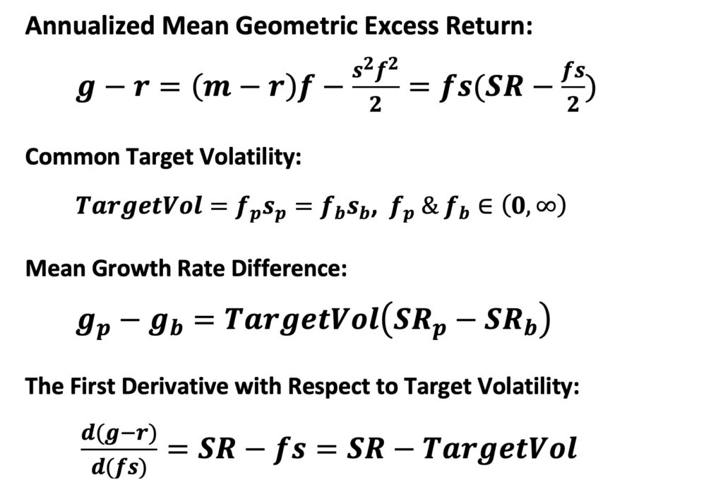

In my earlier article Drawdown risk = portfolio volatility normalized by Sharpe ratio, we demonstrated that (excluding the effects of time series autocorrelation) expected drawdown can be determined by volatility normalized by the Sharpe ratio. We introduced several different drawdown definitions, which are shown below. However, it’s important to note that, unlike with mean growth rates, return autocorrelation (mainly time series momentum) will impact expected drawdown metrics. Nonetheless, our formulas provide the long-term expectation in the absence of autocorrelation or the underlying expected drawdown tendency on which autocorrelation will operate.
Whenever an investor deviates from a riskless portfolio, they assume the risk of falling short of the riskless portfolio’s value. This makes the expected maximum drawdown from the risk-free portfolio value a convenient measure of risk. In the absence of return autocorrelation, the long-term expected value for this metric is simply one half of volatility normalized (divided) by the Sharpe ratio, which corresponds to one half of fractional Kelly allocation (fraction of full Kelly allocation). The expected maximum drawdown from the risk-free portfolio value is calculated as an average over imagined parallel realizations of the maximum drawdown between the present and infinity. As long as the volatility normalized by the Sharpe ratio is lower than 2 (indicating a positive geometric expected return), the metric converges over time. We also find that the expected risk premium drawdown from the previous peak value is governed by the same equation. This metric uses excess returns instead of returns, hence the name “risk premium drawdown.” This metric is calculated as an average drawdown over all time instants from the present to infinity. When at all-time highs, the drawdown is zero.
The most commonly used drawdown metric is the portfolio drawdown from the previous peak value. Below, we present a theoretical formula for the expected value of this metric. This formula also applies to the expected maximum drawdown from the starting capital. These drawdown metrics are functions of the risk-free rate. The higher the risk-free rate and the lower the leveraged risk premium of the portfolio, the more cushion the risk-free rate provides against drawdowns. As the risk-free rate approaches zero, these metrics converge to the expected maximum drawdown from the risk-free portfolio value and the expected risk premium drawdown from the previous peak value.
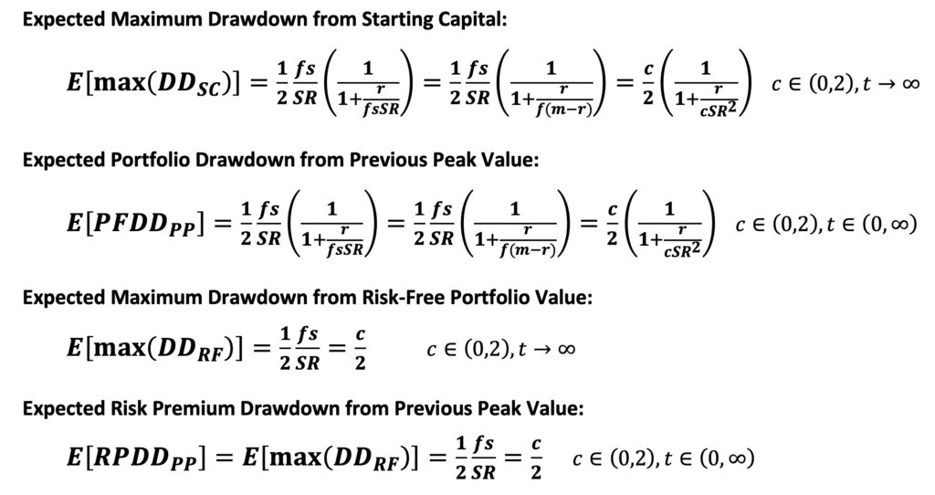
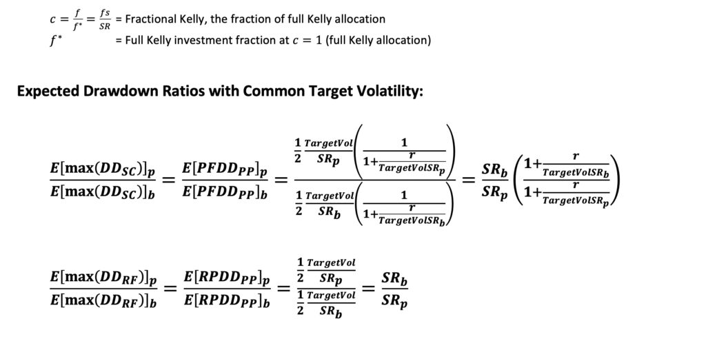
We can set the target volatility equal and calculate the expected (maximum) drawdown ratio between a portfolio of interest and a benchmark portfolio. It’s important to note that using monthly returns will downplay drawdown depth, but since we are calculating a ratio of expected drawdowns, this should not be a problem. In the case of the expected maximum drawdown from the risk-free portfolio value and the expected risk premium drawdown from the previous peak value, the ratio is simply the ratio of the Sharpe ratios. When considering the expected maximum drawdown from starting capital and the portfolio drawdown from the previous peak value, the ratio is still dominated by Sharpe ratios. However, now the cushion that risk-free rate provides plays a role too.
Empirical tests
The empirical tests involve using nominal 10-year treasury total returns from Shiller’s data [5], U.S. stock market total excess returns (dividends reinvested), and monthly T-bill returns from Kenneth French’s data library [6]. Monthly data is utilized, and the 60/40 portfolio is rebalanced monthly. The cost of leverage in these tests is represented by the monthly T-bill rate. Additionally, the tests do not account for trading costs, taxes, or leveraging costs exceeding the riskless rate.
It’s worth noting a difference from Asness’s study regarding the bonds used. While Asness utilized corporate bonds, our study employs Treasury bonds. Treasury bonds are expected to exhibit lower correlation with stocks and offer lower expected returns due to their lack of exposure to credit risk.
The purpose of the tests is to verify and illustrate that our theoretical calculations align with simulations using empirical data. We do not think that 60/40 portfolio is by any means a perfectly diversified portfolio (it is not), but we think and aim to demonstrate it is better diversified than a 100% equity portfolio. Our tests demonstrate that you actually can eat your Sharpe ratio if you leverage your high Sharpe portfolio to monetize your high risk adjusted returns.
Empirical returns
Below, we present the descriptive statistics for three different portfolios: 100% bonds, 100% stocks, and a 60% stocks / 40% bonds mix. We provide the statistics using both instantaneous returns (continuous compounded returns, i.e., log returns) and conventional metrics. While our formulas are accurate with instantaneous metrics, using conventional metrics typically results in very accurate approximations. Therefore, the form of the inputs does not significantly impact the practical outcomes.
In the table, we first compute the mean monthly arithmetic excess return, which is a conventional metric. Then, we convert this to the instantaneous metric by taking the natural logarithm of (1 + mean(monthly_excess_ret)). The same process is applied to the monthly mean riskless rate. The instantaneous mean excess growth rate is derived as the mean of ln(1 + monthly_excess_ret), while the conventional version is obtained by converting it to the yearly compounded excess CAGR using the formula exp(instantaneous mean excess growth rate) – 1. To obtain instantaneous mean growth rate, we calculate mean(ln(1 + monthly_excess_ret) + ln(1 + monthly_riskless_rate)) and convert it to conventional metric as described for the mean excess growth rate. Instantaneous volatility is computed as the standard deviation of ln(1 + monthly_excess_ret), whereas conventional volatility is calculated as the standard deviation of monthly_excess_ret. Finally, we utilize either the instantaneous or conventional metrics outlined above to determine the Sharpe ratio.
The second table below illustrates the comparison of returns between leveraged bond-only and 60/40 portfolios against a stocks-only portfolio. Results are provided for portfolios leveraged to both 100% and 200% of stocks volatility. Leverage multiplier leading to 100% stocks volatility is 1.617 for 60/40 portfolio and 3.429 for bond portfolio. In addition to the mean growth rate difference, we also present the comparison of terminal wealth after 97 years of compounding with the stock portfolio of equal volatility. Both the mean growth rate difference and the benchmark terminal wealth multiplier are accurately explained by our theoretical formulas. Utilizing instantaneous input metrics leads to more precise theoretical predictions, while predictions using conventional input metrics also yield highly accurate results. It’s worth noting that regardless of the format of the inputs, the mean growth rate difference predicted by the formula (as well as the empirical realized value shown in the table) represents an instantaneous growth rate.

The figure below illustrates both the absolute mean excess growth rates and their differences to a stocks-only portfolio at equal volatility. Results are presented as a function of the target volatility level. Theoretical predictions demonstrate extremely accurate performance when the target volatility ranges from zero to approximately two times the stocks’ volatility level. However, as volatility is further increased, things start to break down. At very high volatility (leverage) levels, empirical results increasingly diverge from theoretical predictions. This discrepancy arises because monthly rebalancing becomes too infrequent with very high leverage (we tested the effect of rebalancing frequency in my earlier article The Kelly criterion, capital market parabola & the almighty Sharpe ratio). Even with higher rebalancing frequencies, it’s impossible to achieve the theoretical upper bound for mean excess growth rate when leverage is excessively high. This limitation stems from our theoretical framework, which assumes infinite rebalancing frequency and continuous returns – both unattainable in the real world. In the figure, empirical parabolas abruptly end when the portfolio is wiped out, indicating that the monthly drop in portfolio value surpasses the equity value.
Determining sensible leverage is subjective, but clearly approaching the top of the parabola (the full Kelly allocation) is dangerous. In the real life, the parameters of the parabola are unknown. As demonstrated in my earlier article The Kelly criterion in the presence of uncertainty about risk, this ex-ante parameter uncertainty both lowers the maximum leverage (the full Kelly allocation) and the achievable mean growth rate. While parameter uncertainty is zero ex-post (for realized returns), it remains a crucial factor to consider ex-ante when determining an appropriate level of leverage. Parameter uncertainty can potentially be decreased by thoughtful diversification, which serves as an additional reason to diversify.
Regardless of the definition of sensible leverage, one thing is clear from our theoretical framework: a higher Sharpe ratio portfolio is safer at any given common level of volatility compared to a lower Sharpe portfolio. And the easiest and surest way of increasing your Sharpe ratio is by increasing diversification. It is understandable that many investors either cannot or choose not to use leverage. However, if you are open to using leverage, it becomes challenging to justify leveraging a stocks-only portfolio. The only quantitatively justifiable reason would be that you are able to produce higher Sharpe ratio by actively managing your stocks portfolio than by diversifying broadly within and across asset classes and strategies.
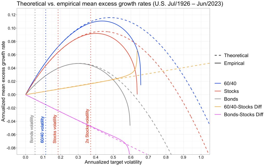
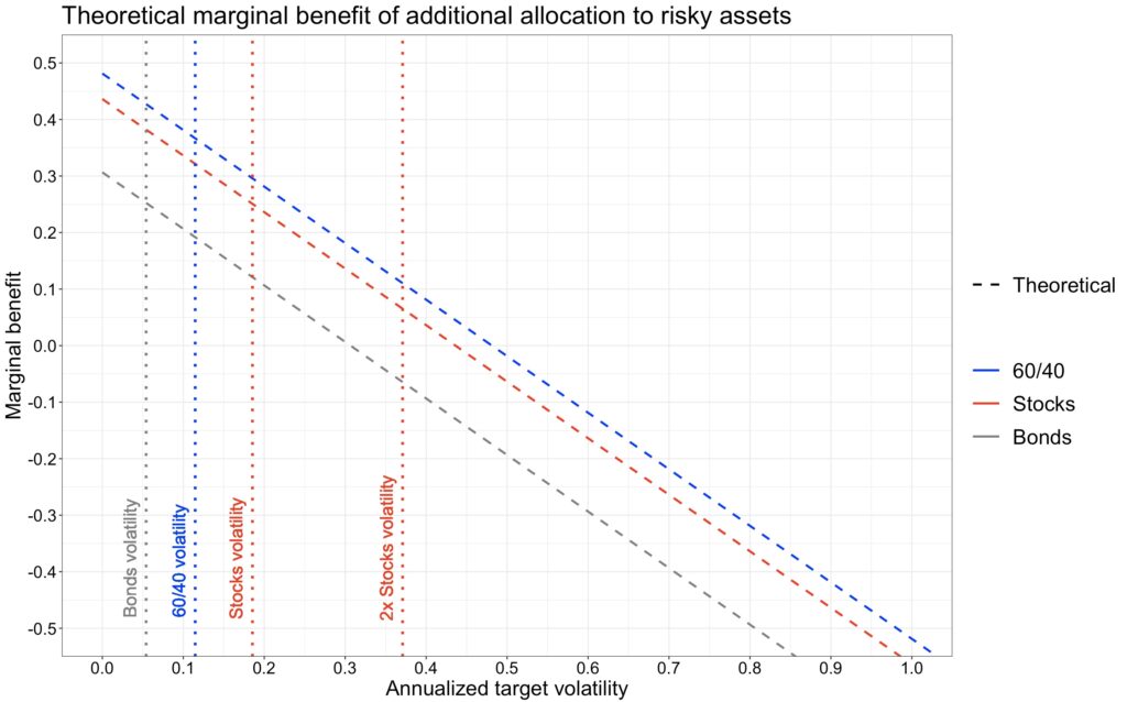
The fact that geometric mean returns (mean log returns) take a parabolic shape as a function of volatility (and hence leverage) implies that the marginal benefit of additional allocation to risky assets is linearly diminishing and eventually negative when volatility exceeds Sharpe ratio. This is illustrated in the figure below. Furthermore, the marginal benefit difference is exactly equal to Sharpe ratio difference between portfolios. Thus, at any given level of volatility, increasing allocation to risky assets is more attractive for a portfolio with a higher Sharpe ratio.
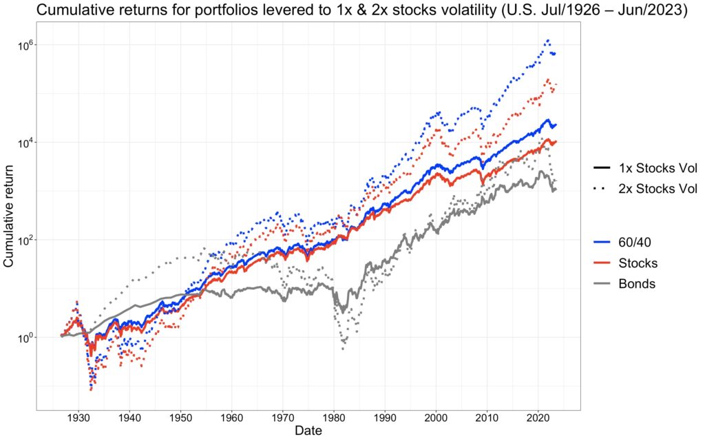
The next figure illustrates how you can eat your Sharpe ratio. Leveraging a portfolio with a higher Sharpe ratio to achieve a common target volatility level across portfolios leads to greater wealth. This is especially evident as the target volatility increases.
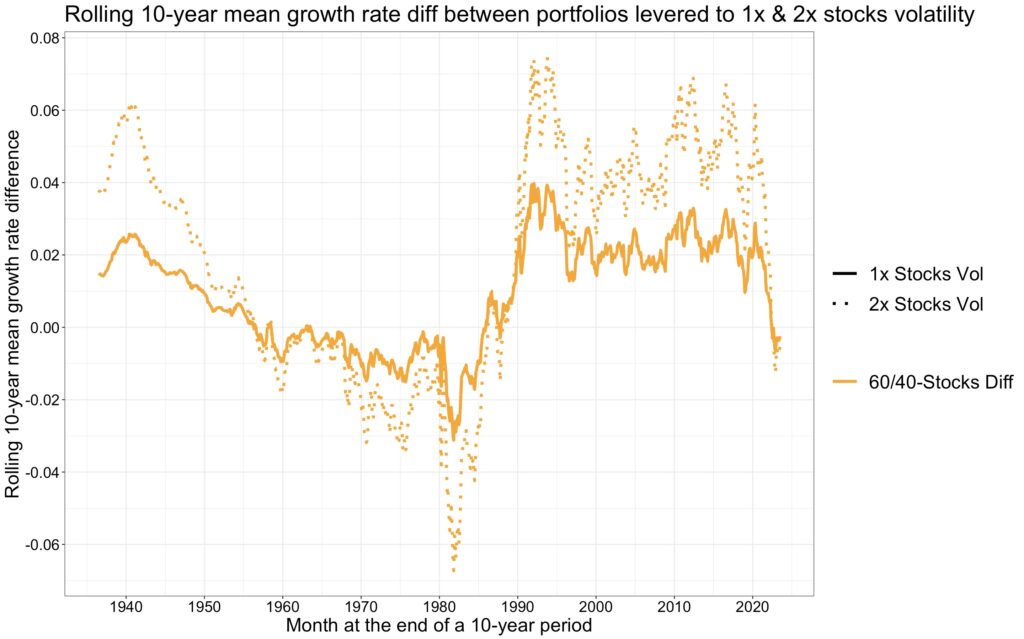
The following figure displays the rolling 10-year mean growth rate difference between a 60/40 portfolio leveraged to stocks volatility and the stock portfolio. On average, the 60/40 portfolio leveraged to 1x all-equity portfolio volatility outperformed the all-equity portfolio by 0.81%, while the 60/40 portfolio leveraged to 2x all-equity volatility outperformed the 2x leveraged stocks portfolio by 1.64%. The 60/40 portfolio leveraged to 1x and 2x all-equity portfolio volatility outperformed the all-equity portfolio in 68.9% and 68.4% of the 10-year periods, respectively.
The worst 10-year period ended in October 1981, around the time when interest rates peaked. The annualized mean growth rate difference then was -3.1%. Conversely, the best 10-year period ended almost exactly 10 years later, after a decade of falling interest rates, in January 1992, with an annualized mean growth rate difference of 4.0%. While there are long periods of over- and underperformance, overall, the leveraged 60/40 portfolio doesn’t seem to have a very high tracking error compared to the all-equity portfolio.
Empirical drawdowns
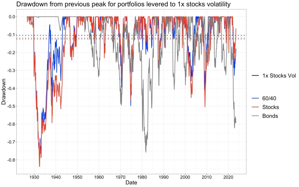
The comparative analysis of drawdowns among portfolios, all leveraged to the volatility of an all-equity portfolio, reveals the peak-to-trough declines (portfolio drawdown from previous peak value) experienced by each. Illustrated in the figure below, the maximum drawdowns over the 97-year period are as follows: 75.74% for levered bonds, 82.33% for the levered 60/40 portfolio, and 83.77% for stocks. On average, calculated across all months, the levered 60/40 portfolio exhibits the lowest mean drawdown, with figures of 11.91% for levered bonds, 10.47% for the levered 60/40 portfolio, and 12.48% for stocks. Levered bonds portfolio has the lowest levered risk premium and therefore benefits the most from the cushion provided by riskless rate. The lower the riskless rate and the higher the levered risk premium and the target volatility, the better the ratio of the Sharpe ratios describes the expected drawdown ratio (the ratios are shown later in a table). If we had used daily returns, the drawdowns would have been larger.
The next figure shows slightly different drawdowns: risk premium drawdown from the previous peak value. This measure is not affected by the riskless rate.
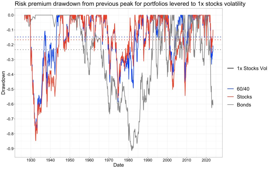
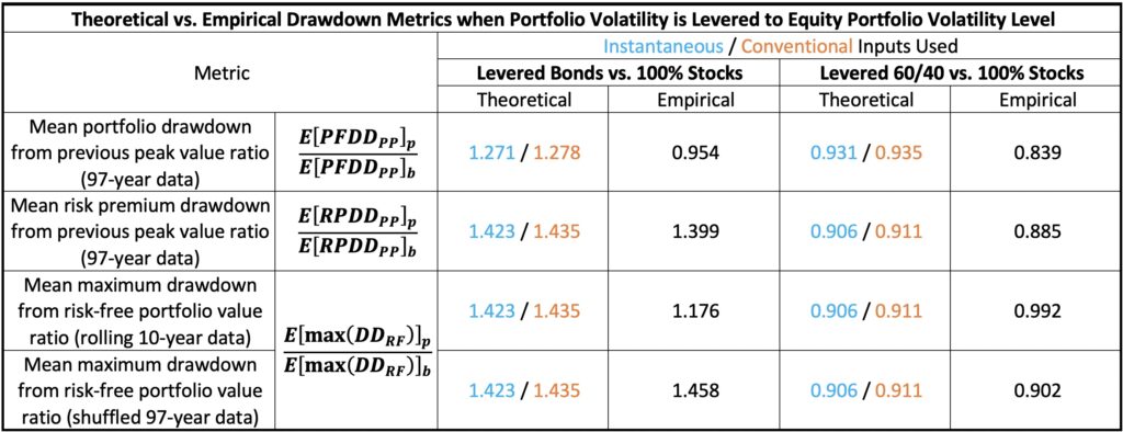
If we were able to measure the mean risk premium drawdown from previous peak value ratio from an infinitely long time period between levered bonds and stocks, and levered 60/40 and stocks, we would (excluding the effect of autocorrelation) expect to see mean risk premium drawdown ratios follow the ratios of Sharpe ratios. Now, with 97 years of data, realized mean risk premium drawdowns are 23.29% for levered bonds, 16.65% for stocks and 14.74% for levered 60/40. The ratios based on these figures are close to predicted theoretical ratios and are shown, along with other drawdown ratios, in the table below.
The same theory applies to the mean maximum drawdown from the riskless portfolio value. Maximum drawdown is tricky to test empirically because of the limited data available. One approach is to run a rolling 10-year window, which empirically yields mean maximum drawdowns of 24.44% for levered bonds, 20.79% for stocks and 20.62% for levered 60/40. Theoretical and empirical ratios are given in the table. We observe discrepancies from theoretical predictions due to autocorrelation. To assess the impact of autocorrelation, we can remove autocorrelation by randomly shuffling the data. By repeating this process 5000 times and calculating maximum drawdowns from the riskless portfolio value for each realization, we can compare the results to empirical findings accounting for autocorrelation. In this test, the empirical mean maximum drawdown corresponds to the 94.7th, 99.3rd, and 97.3rd percentiles among mean maximum drawdowns drawn from independently and identically distributed (i.i.d.) shuffled return data for levered bonds, levered 60/40, and stocks, respectively. Autocorrelation, also known as time series momentum, contributes to fat-tailedness, which is particularly pronounced in levered 60/40 drawdowns, eroding its Sharpe ratio advantage over stocks. Autocorrelation/fat-tailedness is one aspect to consider in portfolio diversification and levered 60/40 doesn’t excel in this aspect. When we measure rolling 97-year maximum drawdowns with shuffled data, we obtain mean maximum drawdowns of 25.03% for levered bonds, 17.17% for stocks and 15.49% for levered 60/40. Mean maximum drawdown ratios calculated from these figures are close to theoretical predictions based on ratios of Sharpe ratios.
We conclude that the levered 60/40 portfolio exhibits lower mean drawdowns compared to the all-equity portfolio. This applies to both the mean portfolio drawdown from the previous peak value and the mean risk premium drawdown from the previous peak value, consistent with our theoretical framework. The maximum drawdown, encompassing both the maximum portfolio drawdown over the entire 97-year period and the mean maximum drawdown from the riskless portfolio value in rolling 10-year periods, of the levered 60/40 portfolio is comparable to that of the stocks portfolio. This parity, despite the Sharpe ratio advantage of the levered 60/40 portfolio, can be attributed to the presence of autocorrelation in the return series, particularly evident in the levered 60/40 portfolio. While the levered 60/40 portfolio demonstrates a lower expected drawdown propensity compared to the all-equity portfolio, the presence of fat-tailedness leaves room for improvement.
Explaining the results of the “Why Not 100% Equities” study
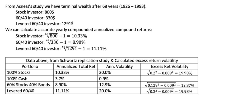
We can indirectly test our theoretical framework by utilizing data and results from Asness’s study [3] Why Not 100% Equities – A diversified portfolio provides more expected return per unit of risk. To gather the necessary data, we refer to the replication study [4] An Update to Cliff Asness’s Study on the Benefits of a Levered 60/40 conducted by Jeremy Schwartz. Schwartz’s study includes the riskless rate, a crucial component for our analysis, as Sharpe ratios are not explicitly provided in these articles. Reverse engineering is required to approximate the Sharpe ratios.
Schwartz provides both the mean and volatility of the riskless rate. We utilize not only the mean to calculate the mean excess return but also the volatility to determine excess return volatility. However, the volatility of the riskless rate is so low that it doesn’t have any practical impact on the calculations. For our analysis, we employ instantaneous excess return for the Sharpe ratio. Since we don’t know whether the volatility is calculated based on log returns or simple returns, our reverse-engineered Sharpe ratio may represent either the instantaneous Sharpe ratio or a hybrid version combining instantaneous and conventional Sharpe ratios. Nevertheless, this distinction should not have a significant practical impact.
We observe that our theoretical equations, employing approximated Sharpe ratios, predict both the empirical mean growth rate difference and the benchmark terminal wealth multiplier very accurately.

Conclusions and implications
When using a common target volatility across portfolios, both the expected geometric growth rate difference and the expected value growth rate difference (based on arithmetic returns) between portfolios are simply defined as the difference in Sharpe ratios multiplied by the target volatility. The portfolio with the highest realized Sharpe ratio is guaranteed to have the highest mean growth rate among portfolios with equal volatility.
When target volatility is equal among portfolios and return time series autocorrelation is not accounted for, the expected drawdown ratio between portfolios, depending on the specific drawdown metric used, is either determined or dominated by the ratio of Sharpe ratios. The portfolio with the highest Sharpe ratio is expected to have the lowest mean drawdowns among portfolios with equal volatility.
Combining the above, when utilizing a common target volatility across portfolios, the portfolio with the highest Sharpe ratio will have the highest mean growth rate and – all else being equal – is expected to have the lowest drawdowns.
The marginal benefit difference of additional allocation to risky assets between portfolios of equal volatility is simply the difference between Sharpe ratios. At any given common level of volatility, it is always more attractive to increase the risky asset allocation on a higher Sharpe portfolio.
It is understandable that many investors either can’t or don’t want to use leverage and therefore stick with the sub-optimal all-equities portfolio. However, for those willing to leverage, it becomes very challenging to justify an all-equity portfolio that foregoes the benefits of diversification which only increase as target volatility increases.
In short, it is about maximizing the Sharpe ratio and leveraging to the desired level of risk.
References
[1] Anarkulova, A., Cederburg, S. & O’Doherty, M. S. (2023) Beyond the Status Quo: A Critical Assessment of Lifecycle Investment Advice
[2] Asness, C. S. (2024). Why Not 100% Equities (Or “I Can’t Believe We Are Doing This One Again”)
[3] Asness, C. S. (1996). Why Not 100% Equities – A diversified portfolio provides more expected return per unit of risk.
[4] Schwartz, J. D. (2021). An Update to Cliff Asness’s Study on the Benefits of a Levered 60/40
[5] Robert Shiller Online Data
[6] Kenneth French. ‘Fama/French 3 Factors’ Kenneth French data library
Article by Markku Kurtti

Thanks for this and all the other excellent articles on your site Markku. I wonder, how the analysis is affected if the investor needs to pay a higher than risk-free interest rate when leveraging up the bonds. It seems the advantage would soon be erased?
Yes, I believe the Sharpe ratio advantage will be erased quickly if we don’t have access to cheap leverage. I am not an expert on implementation, but my understanding is that leveraged instruments which use derivatives can achieve a leveraging cost around e.g. 40 basis points above short-term riskless rate. If you need to arrange the leverage by yourself, I believe the cost will be considerably higher.
If we take my levered 60/40 tests as an example, the leverage multiplier was about 1.6 meaning that we need 60% leverage on top of our own capital. And the growth rate advantage of the levered 60/40 was about 0.8 percentage points. So, if my math is correct, our cost of leverage must be less than 0.8/0.6 = 1.33 percentage points above the cost of riskless rate to maintain the edge from the higher Sharpe ratio. In this example, I believe professionally implemented leveraged instrument will have considerably lower excess cost (in excess of riskless rate) than about 130 basis points, but a retail investor trying to arrange the leverage e.g. using a margin account probably won’t.
And in my 60/40 portfolio example the Sharpe ratio difference to all equity portfolio really wasn’t that big. If we are able to have better diversification and better Sharpe ratio than the 60/40 portfolio, then the cost of leverage may not play as big role (although we may need to leverage more).
My take away from the “Beyond the Status Quo” paper is that bonds is more toasted by inflation than stocks, especially when we consider 38 developed countries data instead of only American data.
I think it’s a reasonable assumption that long-term investors care more about real return rate instead of nominal return rate, and doing Sharpe ratio calculation in real return rate might have different results from nominal return rate. And whether only using American data would yield biased results is also debatable.
I agree that inflation and inflation shocks are a problem for bonds and I think this is well visible also in the U.S. market and e.g. in my figure where I compare the rolling 10-year performance between the levered 60/40 and all-equity portfolio. The worst relative performance occurs during the high inflation period in the 1970s and 1980s.
I also agree that real returns are relevant for investors, but in case (like in my blog post) we compare relative performance, then the relative performance will actually be the same regardless of whether we use nominal or real returns.
One point is that in my test (and in the original study by Asness) we rebalance the 60/40 portfolio to target weight monthly. This rebalancing means that the performance of the portfolio can’t be assessed simply by assessing the performance of stocks and bonds in isolation. E.g. if bonds will have higher correlation with stocks in the long-run than in the short-run, it doesn’t necessarily mean that diversification benefit is much lower because we rebalance in the short-run where the correlation is lower.
well the problem here is that people think the 40% should be ‘bonds’. It should actually be cash or money market. That will not fluctuate with inflation and will allow you to get either interest income or capital for deployment, which is what the entire purpose of the 40% is. Income or redeployment. So 60-40%(cash) is how I see it.
One could use cash instead of bonds, but we would lose the diversification benefit of bonds and would miss the higher Sharpe ratio.
The benchmark used to depict « stocks » makes or breaks these kind of analysis. If the average enterprise within the « stocks » scope is internally levered 60% equity market cap to 40% long term debt. Then what an investor who buys 60% equities and 40% bonds does, is just neutralising that effect in consolidation. An investor who buys only enterprises without debt on the balance sheet will have the equal IRR for equal risk. E.g. investor funds company with 100% equity vs 60% equity + 40% debt, but it remains the same company with same risk profile.
We can have different styles within equities if we wish. The purpose of using market index for equities is to build a simple example. The point is that Sharpe ratio matters when we are leveraging and the easiest way to increase Sharpe is by diversification. Ideally we would have more diversification than just equities and bonds, but using these two makes a simple example.