
Academics have long debated the concept of time diversification, which questions whether time reduces the risk for stock investors or not. Prominent academics, led by Paul Samuelson, have shown (usually mathematically, employing utility functions) that time doesn’t reduce risk. However, investors and financial advisors generally believe that risk decreases with time. A good summary of time diversification can be found in a paper from Kritzman [1].
Time diversification involves so many perspectives that the debate about its effectiveness is unlikely to ever be completely resolved. Nonetheless, we will try to examine the problem of time diversification as simply and objectively as possible (excluding utility functions) by calculating the expected loss. In this discussion, loss is equivalent to falling short of the risk-free rate of return.
It’s widely known that the probability of experiencing a loss in investments with a positive expected return decreases over time. This is because the distribution of annualized returns narrows, meaning the return distribution converges towards its (positive) expected value. This has often led to the conclusion that risk diminishes over time. However, this is incorrect, as risk is not only about the probability of loss but also its depth. Kritzman points out, “Although an investor may be less likely to lose money over a long horizon than over a short horizon, the magnitude of a potential loss increases with the length of the investment horizon.” So, even though the likelihood of loss decreases as time increases, the average loss deepens when losses occur. This happens because while the distribution of annualized returns converges over time, the distribution of total return (ending wealth) diverges, leading to larger losses in terms of total return.
Expected loss is a good metric because it considers both aspects of loss: probability and depth (expected loss is the product of probability of loss and average depth of a loss). Therefore, we define loss risk as the expected loss.
The title of this article is adapted from Asness, Israelov & Liew [2].
The math
Below, we have the essential formulas that determine loss risk (expected loss) and its components: the probability of loss (Probability of loss) and the average depth of the loss when it occurs (Expected loss when loss occurs). Once again, as observed when examining drawdown risk in my earlier article Drawdown risk = portfolio volatility normalized by Sharpe ratio, we see that loss risk is a function of these key portfolio theory variables: investment fraction (f), volatility (s), Sharpe ratio (SR). Furthermore, time (t) becomes a significant factor. These formulas can also be expressed as a function of the Kelly fraction (c), which is equal to portfolio volatility normalized by Sharpe ratio. From the forthcoming figures, it’s evident that the Kelly fraction plays a significant role in determining loss risk (more about fractional Kelly criterion in my earlier article The Kelly criterion, capital market parabola & the almighty Sharpe ratio). Formulas below have been derived from a log-normal distribution. The formulas express loss as a negative number.
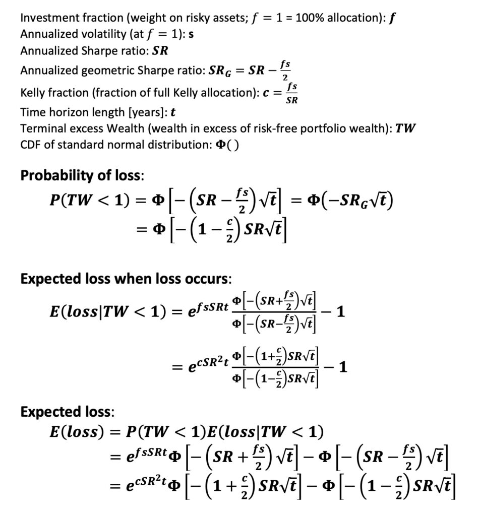
The formulas are highly nonlinear and, except for the probability of loss, rather unintuitive. The probability of loss is influenced only by the geometric Sharpe ratio (geometric mean is used in geometric Sharpe instead of arithmetic, making it a function of the investment fraction) and the square root of time. The larger the geometric Sharpe ratio, the smaller the probability of loss.
Simulations
The formulas are complex, so it’s better to ensure their functionality through simulations. The simulations consist of 5000 to 40000 parallel simulated return histories (fewer for long time horizons, more for short ones). The simulator generates random daily returns, from which each return history is formed. The simulated daily returns follow a Laplace distribution, meaning the return distribution has fat tails, much like empirical daily returns. The returns are random and uncorrelated (i.i.d. returns), which (thanks to Central Limit Theorem or CLT) is why over a longer time frame, Laplace-distributed daily returns behave similarly to normally distributed daily returns. More about CLT in my earlier article Compounding materializes the importance of diversification. Notice, however, that in the presence of return time series autocorrelation, CLT may not work as nicely as in the i.i.d. simulations.
To be precise, we simulated excess daily returns, which are returns exceeding the monthly risk-free rate. This implies that loss is defined as a loss to the risk-free portfolio.
Here are the essential parameters from Kenneth French’s 95-year (July 1926 – June 2021) U.S. daily returns data [3]: The annual (arithmetic) excess mean return is 8.09%, the standard deviation is 17.51%, the geometric excess mean return is 6.56%, and the Sharpe ratio is 0.4618. The theoretical full Kelly investment fraction (f*) is 2.64. These figures are in continuous compounding form.
First, we simulated the probability of loss. The image below shows both theoretical (from the formula provided above) and simulated probabilities. We simulated for different Kelly fractions, essentially different investment fractions (stock allocations). At 100% (f = 1) stock allocation (investment fraction), the Kelly fraction c = 0.38, which would fall between the yellow (c = 0.25) and blue (c = 0.5) curves in the image. The probability of loss increases as the stock allocation (Kelly fraction) increases. With a Kelly fraction of c = 1 (full Kelly), the expected growth rate of the portfolio is at its maximum. 2x full Kelly (c = 2) is critical because it acts as a watershed for the probability of loss: when c < 2, the probability of loss approaches zero over a very long time frame, and if c > 2, a certain loss is inevitable. When c = 2, the probability of loss does not depend on time and remains at 50%.
From the figure, we can see that the simulated loss probabilities closely match the values predicted by the formula. Additionally, it’s clear that the probability of loss approaches zero over the very long term (40-50 years) with a moderate investment fraction. Highly leveraged investors must wait significantly longer, even far over a hundred years, for the probability of loss to be close to zero. In the very long term, excessively leveraged (c > 2) investors approach a certain loss.

What about the other side of risk, the depth of the loss? Another simulation measures the average depth of the loss when it occurs. This is the perspective on risk that Kritzman and Paul Samuelson (rightly) emphasize. The chart shows that the average loss increases over time. Simulated curves closely follow the theoretical ones until there is too little data, meaning that with lower investment fractions, the probability of loss (and therefore the sample size for average loss measurement) approaches zero.

Both perspectives are correct: those who say that risk decreases because the probability of loss decreases over time, and those who say that risk increases because the depth of the loss increases over time. What matters is which of these opposing forces is stronger as a function of time. This is revealed to us by the expected loss metric.
The next simulation and chart show us the expected loss. From the chart, we can see that the simulated curves closely follow the theoretical ones. We conclude that all the provided formulas seem to work well in the simulations.
The chart also illustrates how, over a (theoretically infinitely) long time horizon, the expected loss approaches zero when c < 2, approaches 100% when c > 2, and is 50% when c = 2. The lower the investment fraction, the faster the expected loss approaches zero. So, when measured by the expected loss, time diversification does indeed work, and (assuming c < 2) risk decreases over time.
Interestingly, the average depth of the loss (with these parameters from the US stock market) initially increases more rapidly over time than the probability of loss decreases. However, in the end, the probability of loss starts decreasing more quickly and begins to dominate the expected loss, or the risk. This chart aligns with the general investment wisdom that suggests not investing in the stock market if you need the money in just a few years, especially as the investment fraction increases.
Risk decreases over time towards zero even with very aggressive investment ratios, including full Kelly allocation (c = 1). In practice, 50 years from now, the risk is very low. However, the real challenge is surviving the turbulent 50-year journey, which, for example, with a full Kelly allocation, is a true rollercoaster ride. Drawdown risk interrupts many journeys before we can enjoy the reduced risk, which may have nearly approached zero.

Empirical results
The simulations work well compared to theoretical formulas. What about real-world empirical data?
We use a rolling window for empirical data, going through all possible start dates for each investment horizon length. Because we are examining long-term loss risk, there is insufficient empirical data. For instance, in a 20-year period, we have fewer than 5 independent data points from 95 years of data. The scarcity of independent data is a problem, especially for longer horizons. In the empirical data, We exclude the curve for c = 2.25, as at such a high investment fraction, the entire capital is lost in a single day, such as in the October 1987 crash. However, with c = 2 (equivalent to a 528% stock allocation), you can barely survive that crash, at least in this theoretical analysis.
Let’s start with the probability of loss again. The chart below shows the theoretical curves and the empirical curves obtained through the rolling window. Interestingly, the curves do not align even in the short term, where there is a reasonable amount of independent data. In the short term (ranging from zero to about seven years depending on the investment fraction), empirical probability of loss is significantly lower than the theoretical (or simulated) probability. What causes this difference? The difference arises from the autocorrelation of empirical timeseries data. An example of this is the momentum effect: good returns are likely to be followed by more good returns, and bad returns are likely to be followed by more bad returns. Empirical returns are not independent of their predecessors, unlike the theoretical formulas and simulated returns. Autocorrelation in the time series makes the compounded returns fat-tailed. As an experiment, we randomly shuffled the empirical daily returns, eliminating the time series correlation. With shuffled returns, the probability of loss was much closer to its theoretical value.

Empirical probability of loss is indeed significantly lower in the short term than theory suggests. This should be good news, right? Well, if there’s something good, there’s also something bad. The next chart shows the empirical average depth of loss when a loss occurs. The empirical depth of loss is significantly higher in the corresponding short term compared to the values predicted by theory. Once again, the explanation lies in the fat-tailed empirical returns. When returns have fat tails, the return distribution has a high peak, narrow shoulders, but thicker tails. In such cases, the typical return is closer to the average (the probability of loss has decreased), but extreme returns are more extreme (in the case of losses, the depth of loss has increased).
This is a good example of how investment risk is like energy: you can’t eliminate a certain investment period’s risk (or investment risk in general), but you can change its form. In the empirical data, there is less probability of loss risk, but the risk hasn’t disappeared; it has transformed into depth of loss risk due to the thick tails.

Both the empirical probability of loss and depth of loss curves were quite noisy in the previous charts. As mentioned earlier, there is inevitably too little empirical data. In the following chart, we combine these two metrics, and because they affect somewhat in different directions, the curves are less noisy. Now, despite the scarcity of data, we see that the empirical expectation of loss, i.e., loss risk, appears to follow its theoretical prediction reasonably closely, at least when the investment horizon is less than 15 years.

Insufficient empirical data downplaying long-term equity risk
Let’s take a closer look at the empirical data for a 100% equity allocation (investment fraction f = 1, which corresponds to a Kelly fraction of c = 0.38). In the graph below, you can see both the theoretical and empirical curves. As described earlier, the expected loss is a good metric for assessing loss risk because it considers both the probability of loss and its depth.

Let’s consider some additional empirical metrics. In the following figure, you can see various percentiles of loss and also the empirical maximum loss, which dates back to the 1929-1932 Great Depression. It’s worth noting that the median loss is very close to the average loss. This means that the average loss represents a typical loss well, even over a long time horizon.

From the previous figure, we can see how the losses converge towards zero as time approaches 20 years. In fact, over an 18-year period, the empirical probability of loss (to risk-free portfolio) is zero. From the theoretical probability curve, we can see that it remains clearly above zero even at the 20-year mark. This is, for example, Jeremy Siegel’s point (Stocks for the Long Run): empirical risk (measured by standard deviation) and therefore also the probability of loss is lower over a long time horizon than theory predicts implying that empirical equity risk decreases more rapidly than theory predicts. Siegel justifies this phenomenon with mean reversion, meaning that over the long term, high returns are followed by, on average, lower returns and vice versa.
Mean reversion may well be true, but it’s hard to prove because it’s a long-term phenomenon, and there is too little empirical data. However, in fact, you don’t need mean reversion to produce return curves that look like empirical data. You just need too little data.
In the following figure, we have a hundred times more data than the empirical 95 years. We pass 9500 years of simulated (i.i.d.) data through the same rolling window as we used for the 95-year empirical data. From the figure, we can see that the probability of loss follows the theory and does not go to zero, and losses deepen as time extends.

Next, the same simulation passed through the rolling window, but now with short 95-year data (i.e., the same amount of data as in the empirical data set). It looks very similar to the empirical data: the probability of loss goes to zero at the 18-year mark, and loss depths begin to mitigate after just 10 years. And in this simulated data, there is no mean reversion. The data is purely i.i.d., meaning entirely random and uncorrelated. We simply have too little data for rare events (the largest losses) to occur and impact the metrics.

The previous image was just one simulation with a small amount of data. Perhaps its similarity to empirical data was a coincidence? In the next image, we are showing 501 similar simulations over time and presenting the median values (i.e., the middle, typical values) from all the curves. It still looks very consistent. The image shows that the median metrics follow the theoretical curves for just under ten years. With 10 years based on the 95-year daily returns, it seems to be the maximum investment horizon for which the theoretical formulas somewhat depict empirical loss metrics. This is in line with the empirical statistics.
Using the energy analogy, we may think of long-term equity risk in the empirical data as potential energy (unrealized investment risk) waiting to be transformed into kinetic energy (realized investment risk).

Based on this, it seems that the long-term loss risk measured from empirical data is partly hidden, unrealized. Elroy Dimson says: (for any given period) “Risk is that more things can happen than will happen.” A very good description of risk. We’ll add to this (for repeated periods): “What can happen will happen.” It’s just a matter of time. Too short empirical data doesn’t give us a true picture of everything that could have happened in history, but we can trust that everything possible will happen at some point.
Conclusions
Defining loss risk as the expected loss considers both the probability of loss and its average depth, making this metric effective for fat-tailed returns.
For investment horizons of less than 4-7 years, empirical loss probability has been lower than what is predicted by a theory based on normally distributed, independent and identically distributed (i.i.d.) daily returns. Conversely, when losses occur, they have been deeper than what the theory predicts. This appears to be due to the fat-tailed nature of the returns, which is maintained by the correlation in the return time series.
Long-term loss risk, as measured by the expected loss, decreases over time (with reasonable stock allocation levels). Time diversification works when the investment horizon is long and the investment level is sensible.
At 100% stock allocation, in the short term (less than a few years) loss risk initially increases and then levels off. Time diversification only begins to work after more than five years.
Time diversification requires a shorter time to start working as the investment level (Kelly fraction) decreases.
Loss risk decreases over the long term as a function of time, but for most investors, the psychologically significant drawdown risk may be the limiting factor.
Mean reversion is not needed to explain why the empirical long-term standard deviation and loss probability for stocks are lower than theory predicts. A too-small sample size (a too-short return history) can largely explain the phenomenon.
Stock return history is very short and underestimates the real long-term investment risk. A short return history typically does not include the rarest events (returns) that will occur over a long enough time frame.
References
[1] Kritzman, M. (2015). What Practitioners Need to Know… About Time Diversification
[2] Asness, C., Israelov, R. & Liew, J. M. (2011). International Diversification Works (Eventually)
[3] Kenneth French. ‘Fama/French 3 Factors’ Kenneth French data library
Article by Markku Kurtti
I’d have to examine with you here. Which is not one thing I usually do! I take pleasure in reading a post that may make folks think. Additionally, thanks for permitting me to comment!